Visualizing Data for Legal Advocacy
by Peter Kim, Communications & Digital Engagement Manager, Pivot Legal Society
![]() Pivot Legal Society’s mission is to target and remove systemic barriers to justice for communities affected by poverty and social exclusion. We do this through strategic litigation, advocacy, and public education and outreach to empower those affected by homelessness, police violence, people engaged in sex work, and individuals who use substances.
Pivot Legal Society’s mission is to target and remove systemic barriers to justice for communities affected by poverty and social exclusion. We do this through strategic litigation, advocacy, and public education and outreach to empower those affected by homelessness, police violence, people engaged in sex work, and individuals who use substances.
Winning the court of public opinion

As a legal advocacy organization, our most pressing battles to advance the rights of disenfranchised communities are fought in the courtrooms of law; but in today’s digital age, where the flow of information is never-ending, we strive for change in the court of public opinion as well. We do this through our use of data as a powerful visual tool to convey meaning in an accessible manner.
Making sense of data using interactive infographics
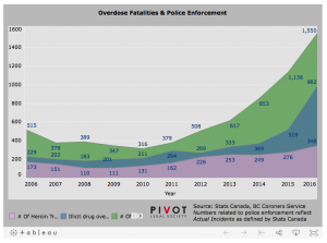
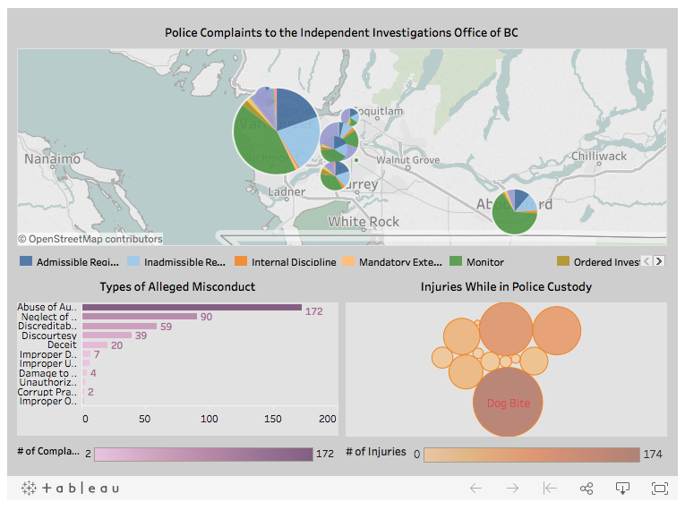
Our four campaign areas—sex work, drug policy, homelessness, and police accountability—are richly supported by data sets and research that remains, in large part, inaccessible from mainstream consumption. Pivot translates this information into a meaningful form to enhance its communications campaigns: interactive infographics.
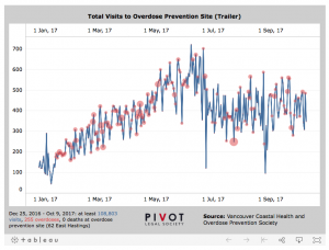
We use data to tell a story, be it the dire urgency of the current overdose epidemic or ways in which police enforcement interferes with public health efforts. Interactive infographics deliver meaning instantly. Where a paragraph of words struggles to convey its message in minutes, a graph or chart can effortlessly deliver meaning within seconds.
This is significant because of the way in which people consume information in the social media age. Words alone often fail to register because of shortened attention spans and a propensity to rapidly scroll on our smartphones. We have become an audience spoiled by choice and quantity. Infographics are that visual aid to capture the interest of the easily distracted and draw them in.
Increasing online engagement
We have seen a measurable impact in the way our visuals have engaged our online audience. This blog post on the scale of British Columbia’s overdose crisis and harm reduction efforts had an average “time on page” value of 6:38 seconds—an eternity by online standards.
Plotting a harm reduction map
Click on a location to learn more about the site. Zoom in and out to get a better view.
Pivot has created one of the first harm reduction maps of its kind in Canada, plotting the locations of all Health Canada-approved supervised consumption sites and many of the country’s overdose prevention sites. The content has received over 30,000 impressions so far and has been shared with other health service providers.
Using interactive infographics as a tool for legal advocacy
The innovative yet disruptive forces of the internet are forcing industries to evolve. The news media and brick and mortar retail are two such examples where adaptation isn’t an option, but rather an imperative for survival.
To a lesser degree, how we communicate and engage our community of supporters and the public more generally must also adapt to compete in the marketplace of information, already a crowded space where the strength of content alone isn’t enough. Interactive infographics are just one tool we use to give us the edge and help us achieve our strategic objectives to improve the lives of Canada’s most marginalized people.
Stay Informed with Pivot Legal Society:
![]()
![]()
![]()
![]()